Case Study: Elevating the Iconic Avocado
California Tortilla approached us with a challenge: their key avocado sign, previously a standard channel letter design, needed a fresh look that aligned with their bold and dynamic brand identity. Recognizing an opportunity to embrace the dimensionality of their avocado logo, we proposed a redesign that utilized layers of backlit PVC to create a striking, multi-dimensional effect. This case study explores how we took the sign from concept to completion, focusing on value engineering and creative innovation to transform a familiar element into a show-stopping centerpiece.
As you read on, you’ll see how each phase of the process contributed to reimagining and elevating the avocado sign.
1. Concept and Design Development
Reimagining a Familiar Icon
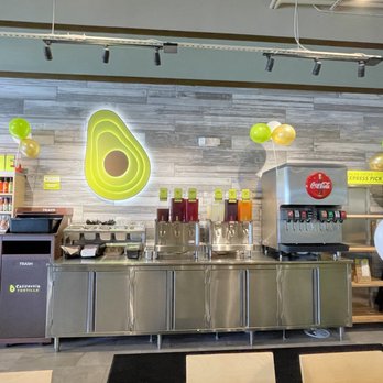
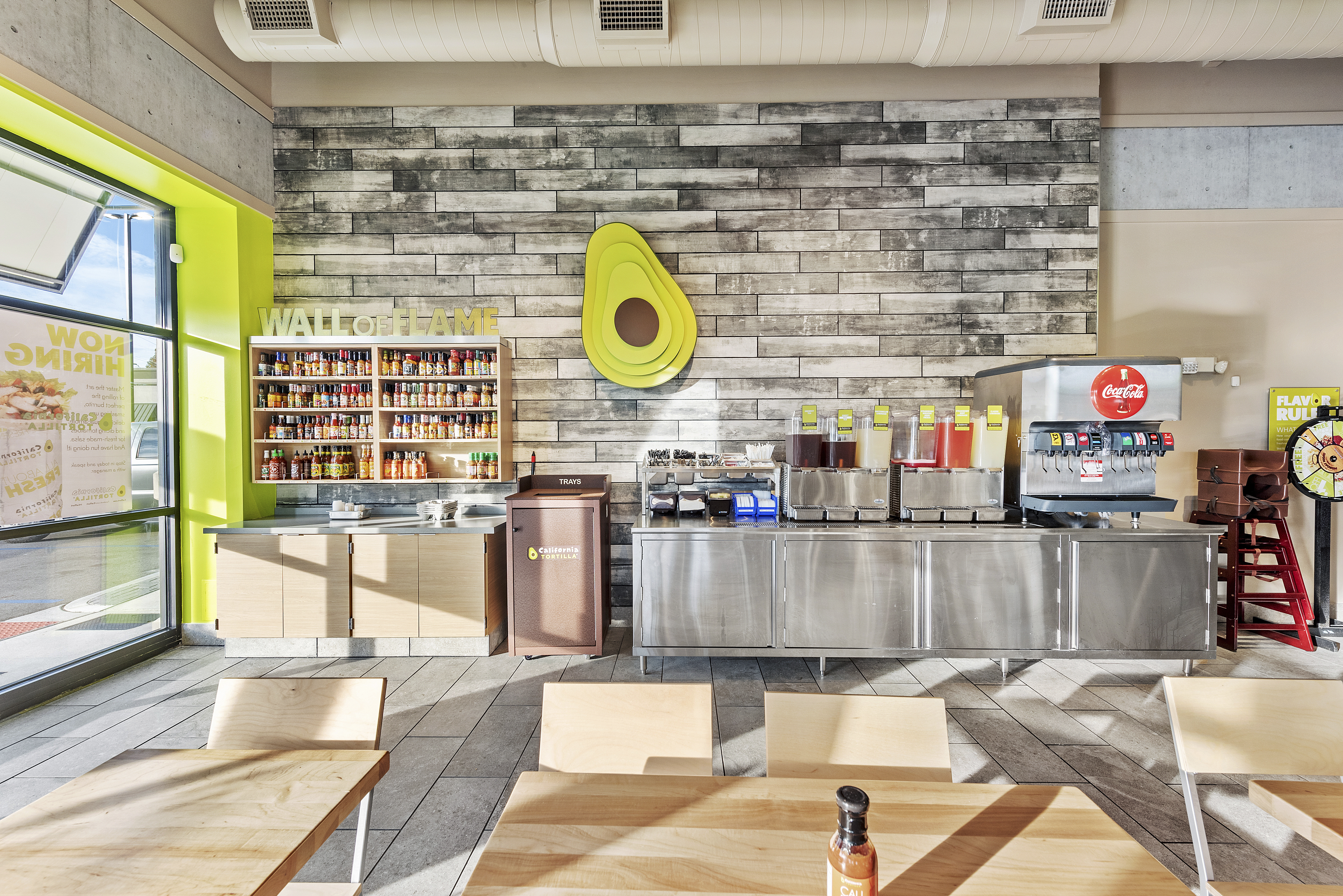
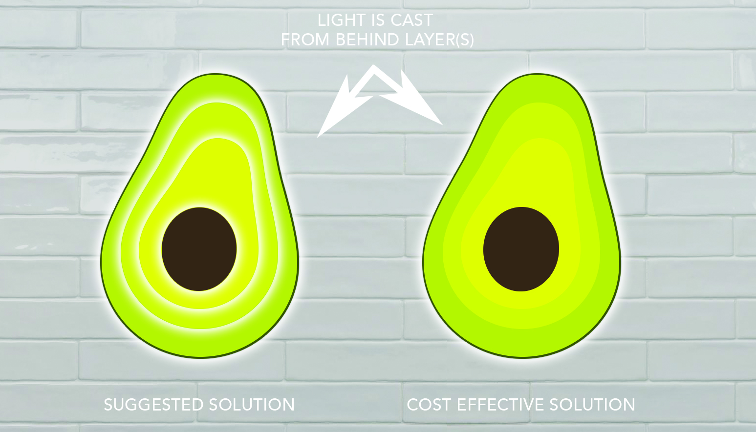
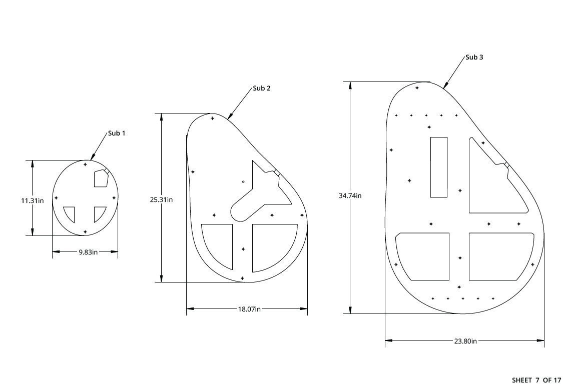
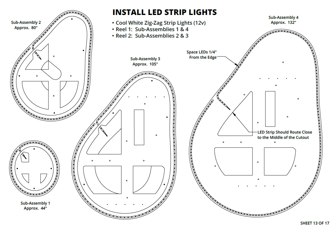
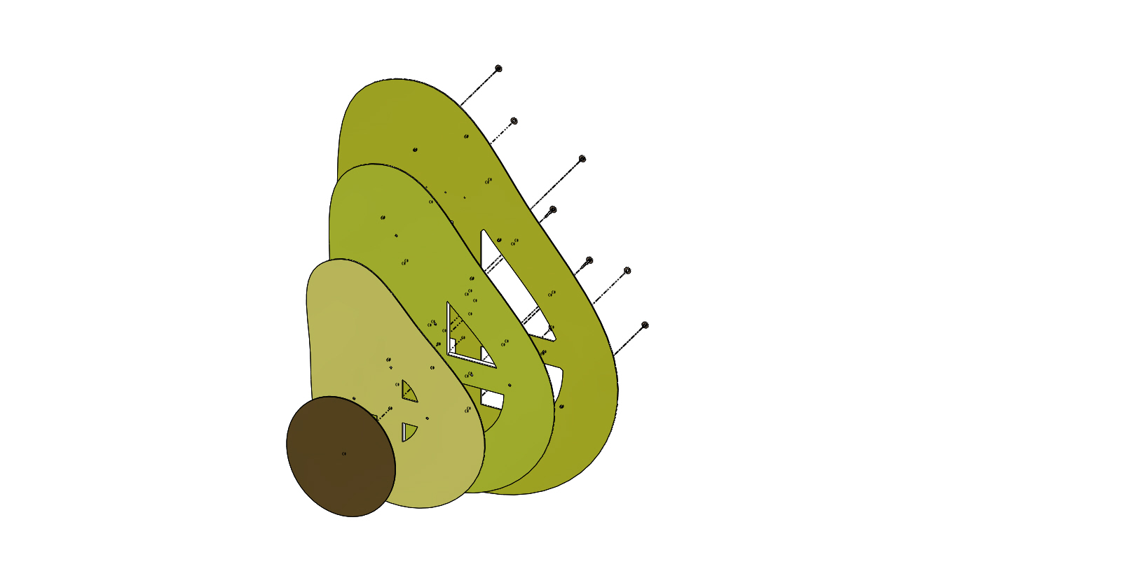
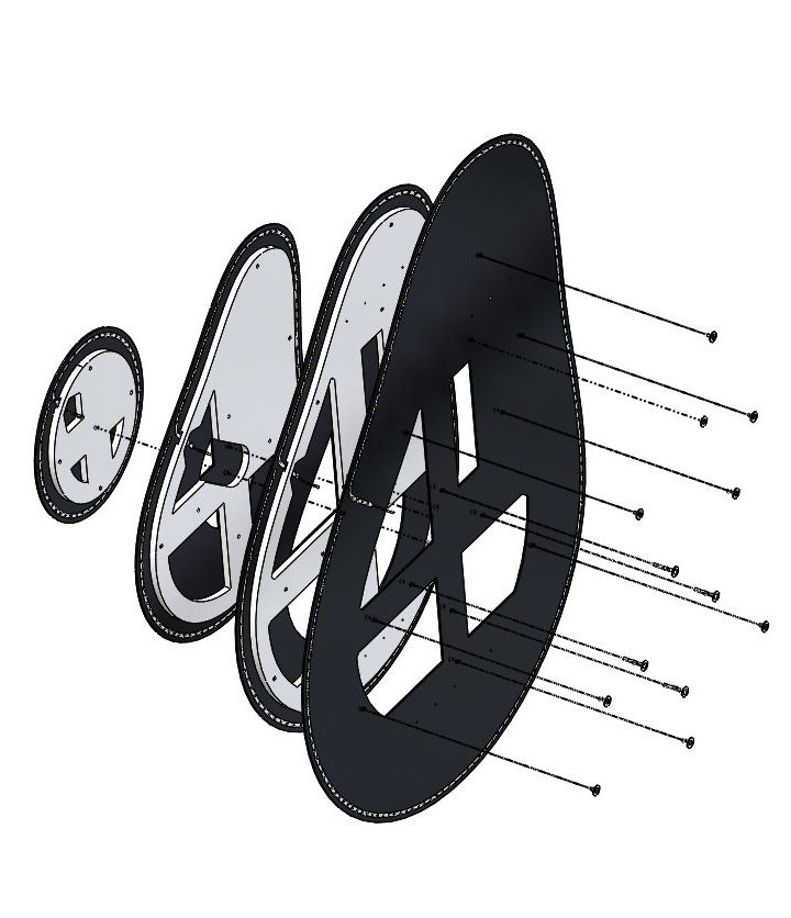
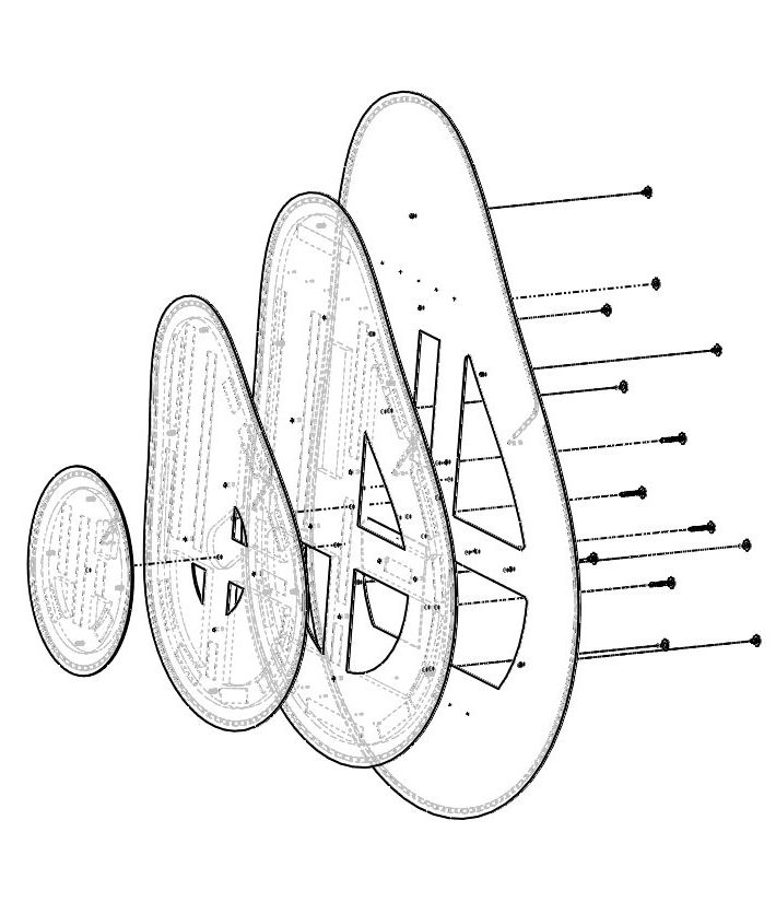
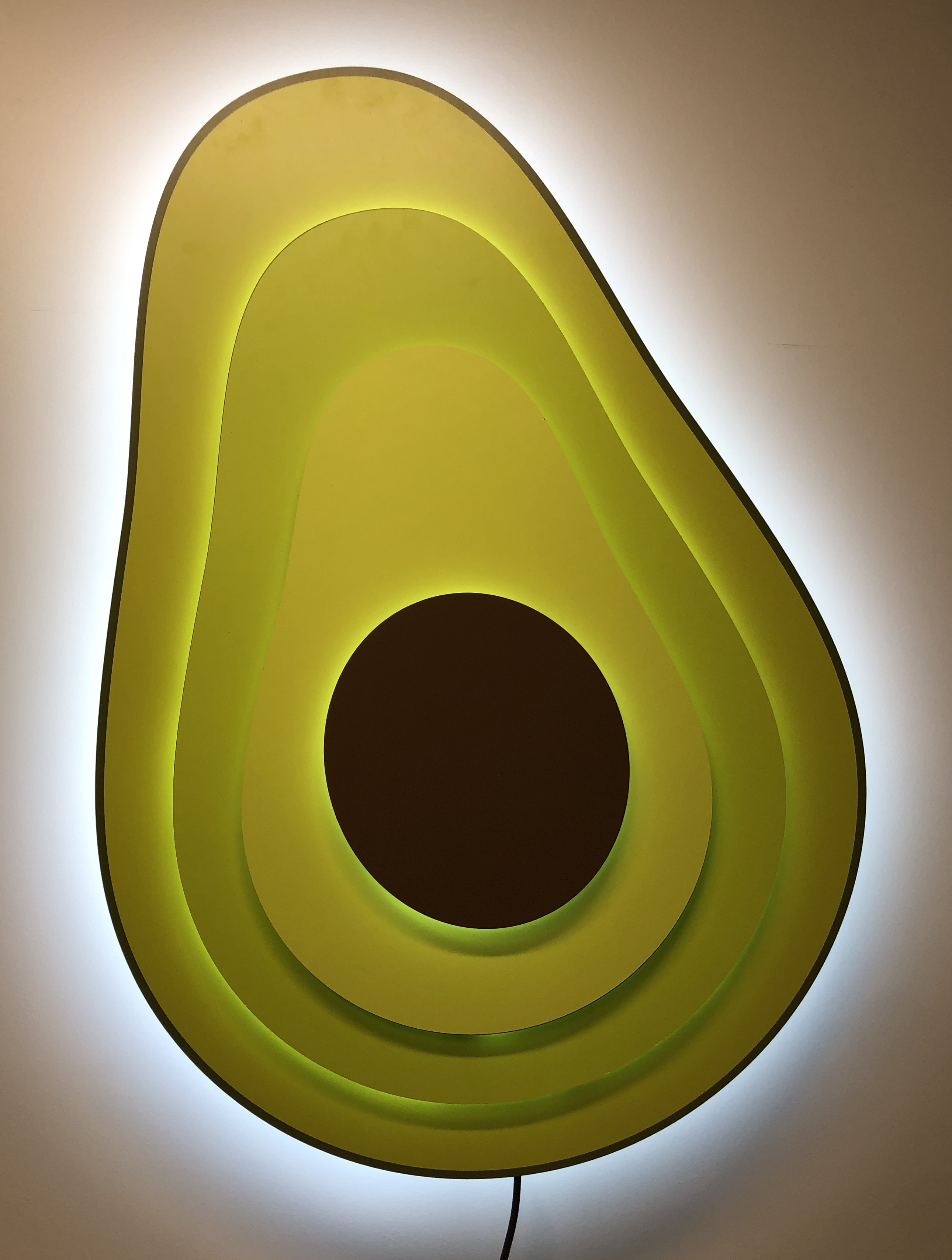
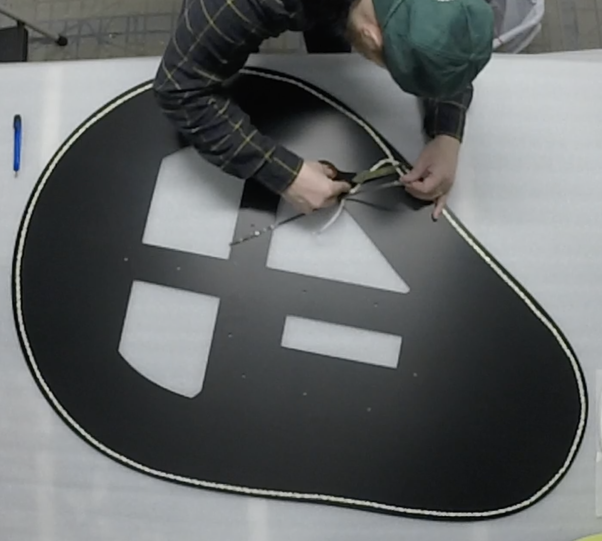
To bring new life to the avocado sign, we proposed moving away from the basic channel letter design and embracing the layered nature of the logo itself. By separating the layers and incorporating backlit PVC, we created a design that added depth, texture, and dimension. This phase involved sketching and digital renderings to ensure the design aligned with the client’s brand values and aesthetic.
2. Prototyping and Testing
Perfecting Layers and Lighting
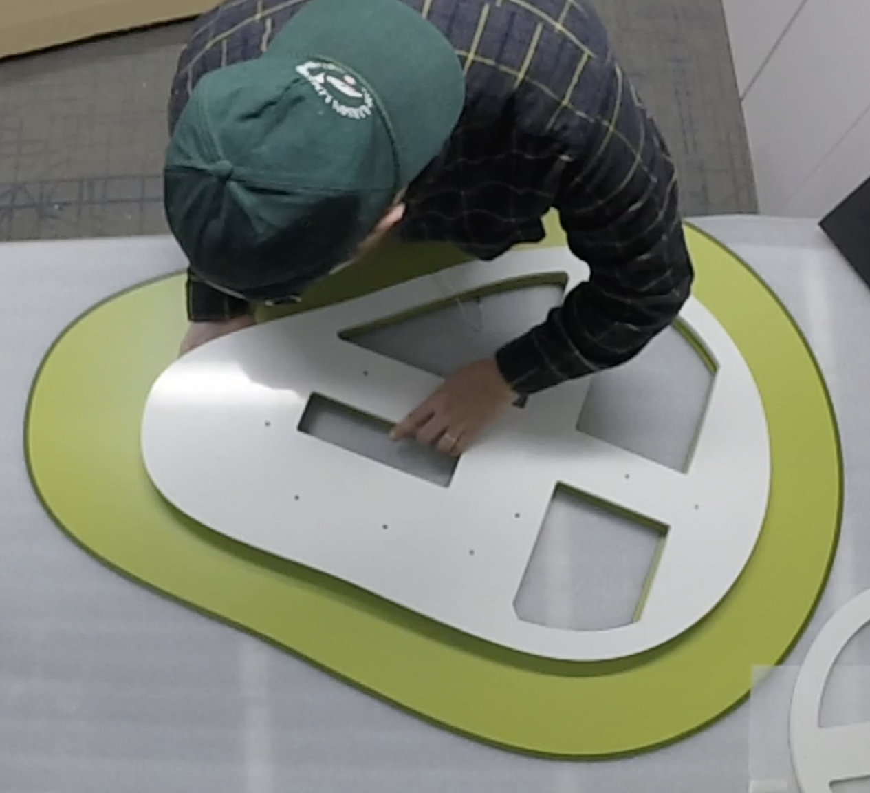
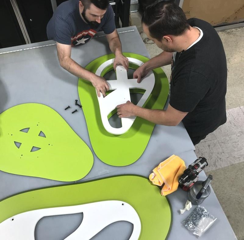
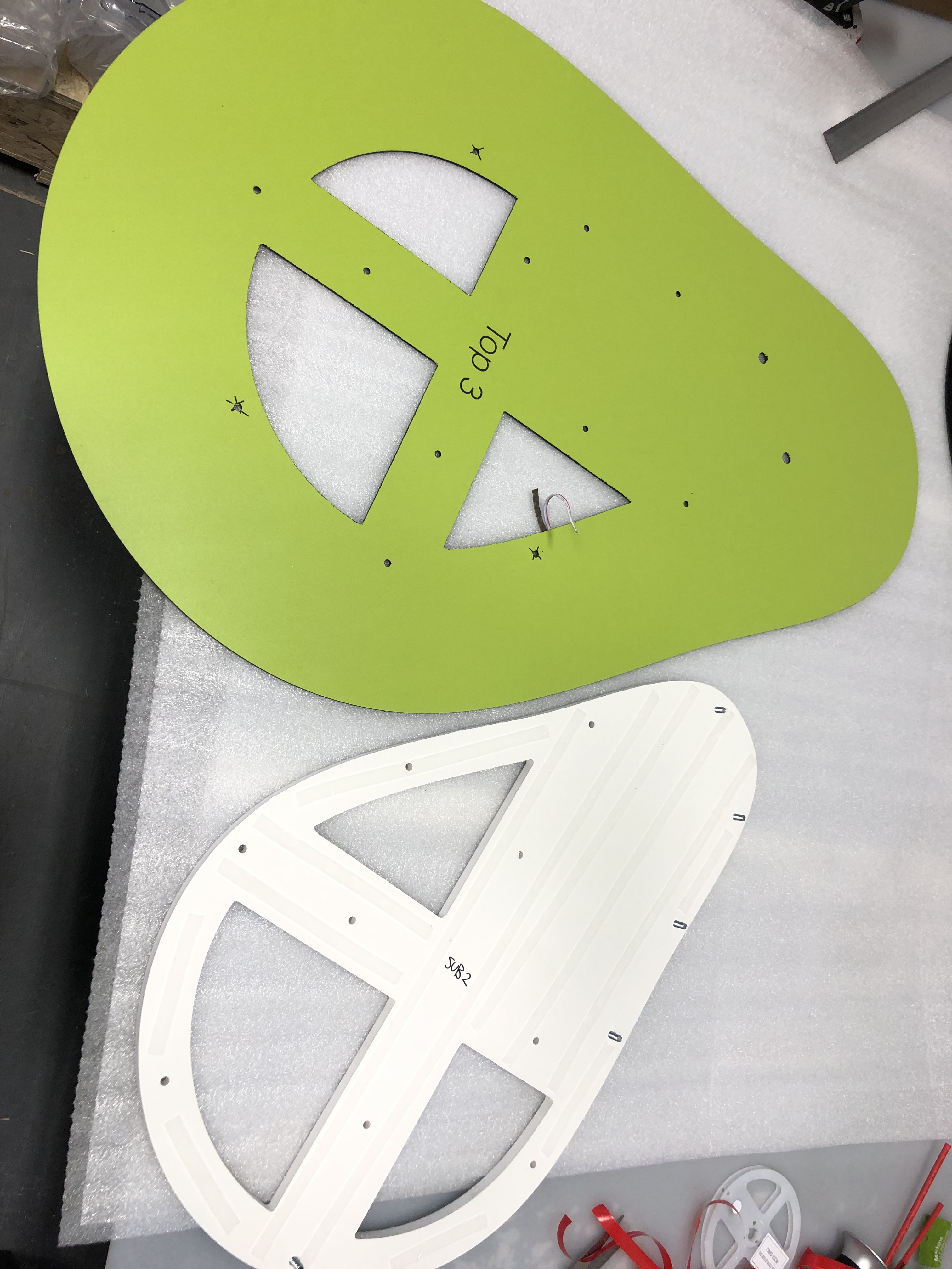
With the design finalized, we developed prototypes to test how light interacted with the layers of PVC and the spacing between them. This phase was crucial in achieving the right balance of illumination, ensuring the avocado appeared vibrant and dynamic while maintaining durability for long-term use.
3. Production and Implementation
Turning Vision into Reality
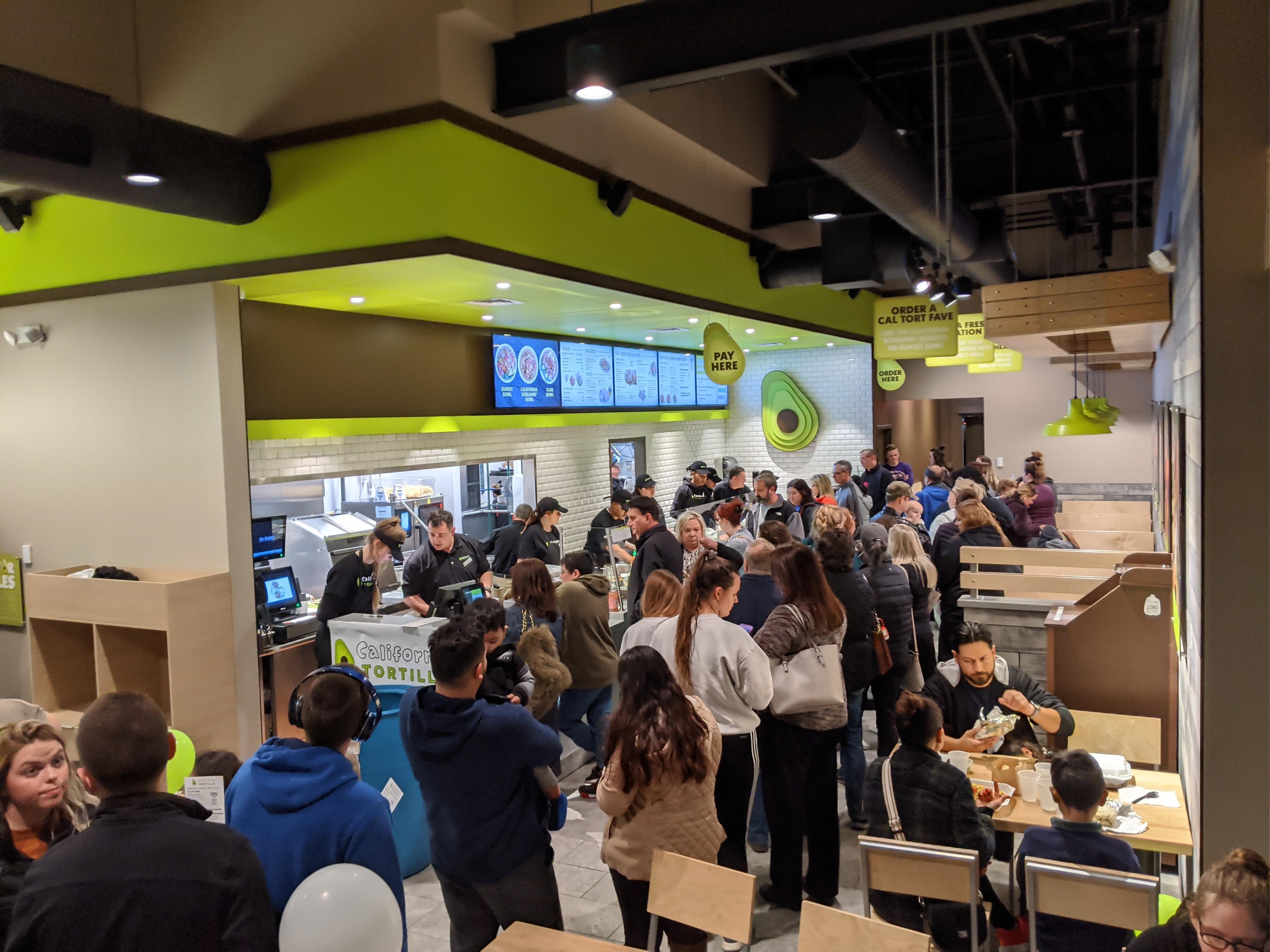
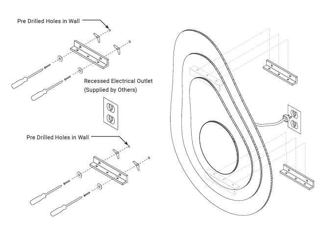
Once the prototypes passed testing, we began production using value-engineered materials that met both budget and quality requirements. The layered backlit design was carefully assembled with scalability in mind, making it a key element of California Tortilla’s standardized signage package. This mandatory sign is now set to be introduced in all locations moving forward, elevating the brand’s visual identity across their franchise network.

4. Ongoing Impact and Monitoring
A Sign That Embodies the Brand
Since installation, the layered avocado sign has become a signature element of California Tortilla’s locations, drawing customer attention and complementing their vibrant dining environments. We continue to monitor its performance, ensuring the materials and lighting hold up under various conditions, while the feedback from franchisees and customers reflects its success as a branding focal point.